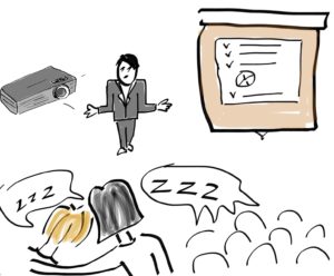
So you insist on using PowerPoint even though you know how boring it is ? Well, here are 15 tips from me.
- Skip PowerPoint. I can insist too. Prepare your speech so that you can present even if the OH-projector breaks down. If your reason for having slides is that you otherwise won’t remember the disposition, it is a great disrespect towards the audience. Instead of putting the time into building slides, put it in your preparation of how you want to say things.
- Before going into your ppt-library, first write down a few words on the purpose, audience, goals, content and structure. Now, you can turn on your computer.
- If you absolutely need an agenda slide – don’t write more than three bullets. Just remember that this is a sleeping pill.
- Have only one message per slide. Although I am not a fan of PowerPoint, I’d rather you have five slides with one message on each one, than one slide packed with messages.
- If your reason for packing the slides full of info is because it will later be used as a hand-out: Make two versions. Always consider the context of how the audience will digest the information
- Limit the number of object on the slide to maximum 6 objects per slide. It’s like a dice. You don’t have to think how many dots the dice has. But when you go above 6, your audiences’ brains need to work too hard. Remember: The logo is one object. Slide counts is another. A “Strictly confidential”-text is a third.
- If you show a slide – be quiet for a few seconds. Let the audience read it first. Remember: The audience cannot focus on you and the slides at the same time.
- No speaker notes on the slides – ever! No sentences on the slide – unless it is a quote
- Make sure to run spell check.
- Minimum font size: 24
- Maximum number of font sizes: 3
- Pictures on slides are more powerful than words. But make sure it is relevant. Otherwise it is called a decoration. If it is a decoration – skip it.
- One of the best functions/letters on the keyboard when using PowerPoint is: B Use it every time you talk about something that doesn’t complement the current slide. W Is pretty good too.
- Make sure you have contrast on the slide to make it easy to view.
- If you want to show graphics – make them easy to read and explain them. Anything unreadable to the audience or not relevant, skip it. And if you have a complex diagram for instance that you MUST show, build it up and guide the audience through every step. But make sure it make sense, otherwise animations will just be a distraction
Good luck with your presentations //Antoni


